Forecasting s-curves is hard
Companies, agencies, institutions, etc
immunity’
Mobile App Report
World Health Organisation
Google
Facebook
People
George Box
Nieto et
al
Comscore Whitepaper
LikeLikeThis
Groups
No matching tags
Physical locations
S
Places
No matching tags
Locations
US
China
U.S.
Events
error’
Summary
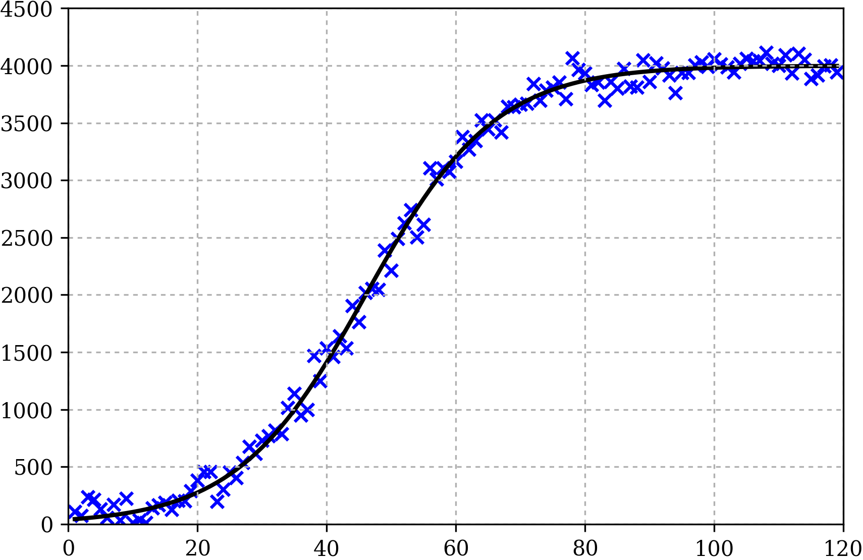
In reality, while we can say that the overall trend of the data is likely to fit to some s-curve, the individual points will not all lie along it. The points shown are “noisy observations” – which is the maths-y way of saying ‘points from the curve with a random amount of error applied’.In this case, the s-curve model is a perfect fit – I have literally generated the data from an s-curve. All this to say, that this example is idealistic – in reality there is unlikely to be a curve that fits the data so well. Below is an animation showing the best fit s-curve (found using a least squares optimisation) as more data becomes available.It may not be surprising that in the exponential growth phase the estimate is very bad, but even in the linear phase (when 40+ points are available) the correct curve has not been found. In fact, it is only once the data starts to level-off that the correct s-curve is found.
As said here by